The Camel on the Cover: What British Jackets Keep Getting Wrong About Arabic Novels
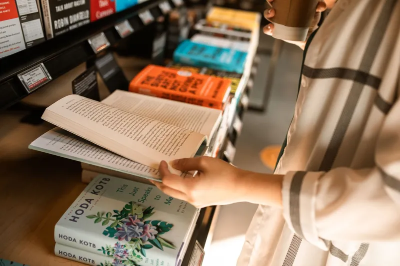
There is a particular shade of orange that only exists on the cover of an Arabic novel published in Britain. It sits somewhere between sunset and sandstorm, usually behind a lone figure, usually female, usually walking away from the reader. Add a line of calligraphy in the top corner, crop a minaret at the edge of the frame, and you have a jacket that could belong to almost any Arab novel published here in the last two decades. It is a look so reliable that you can spot it from the far end of a Waterstones.
The trouble is not that these covers are ugly. Many are beautifully made. The trouble is that they are doing a very specific job — signalling "foreign, but safely so" — and that job has consequences for how the books inside are read, stocked and sold.
The dune is doing an enormous amount of work
Deserts are real. Arabic literature has deserts in it. But the dune has become a shorthand that flattens an entire region's geography into a single postcard. A novel set in a Beirut apartment block, a Cairo newspaper office or a Glasgow flat can still end up with sand on the front, because sand is legible. It says "Arab world" to a browsing shopper in Bristol in under a second, and it says it without requiring the buyer to know anything about the book.
Designers will tell you this is not laziness so much as pressure. "The brief is nearly always about instant recognition," one jacket designer who has worked on several translated Arabic novels told me. "You have a tiny window on a table or a thumbnail online. If the cover is ambiguous, the buyer moves on." Sand, she said, is a form of reassurance. It tells the reader they are getting the thing they think they are getting.
Script as wallpaper
Then there is the calligraphy. Arabic script is genuinely one of the great visual traditions, and using it on a cover is not inherently wrong. The problem is when it stops being language and becomes texture — swooping, illegible brushstrokes used the way a 1990s travel brochure used kanji. When a British edition takes the title and renders it as decorative flourish, it quietly tells the reader that the original words are ornament rather than meaning.
Compare that to the Arabic editions. Pick up a Beirut or Cairo printing of the same book and you will often find something far more confident: bold type, stark photography, a portrait, a building, a colour field. Egyptian and Lebanese publishers have their own commercial habits, and not all of them are subtle. But they tend to treat the book as a contemporary object rather than a souvenir.
The cropped minaret and the veiled silhouette
Two more entries in the standard kit. The cropped minaret says "this is about religion" without committing to saying anything about religion. The veiled woman, seen from behind or in profile and never quite meeting the reader's eye, says "this is about oppression" — or, depending on the decade, "this is about liberation." Either way, it is a shortcut that pre-loads the reading before page one.
This matters most for books that are neither. A comic novel about a family wedding in Amman does not need a silhouette at dusk. A thriller set in a Dubai office block does not need a mosque at the edge of the frame. When the jacket insists on gravity, the reader who wanted the comic novel or the thriller may not find it.
What the buyer is actually being sold
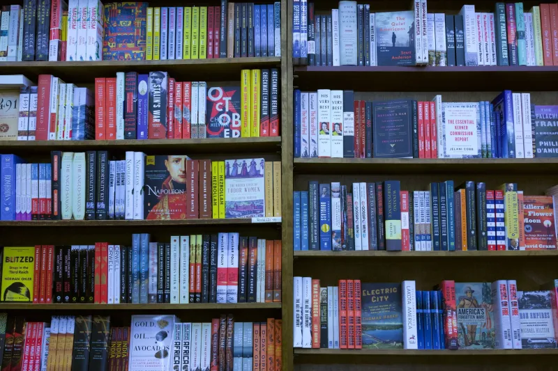
Booksellers notice. "Customers come in with a picture in their head of what an Arabic novel looks like," says a fiction buyer at an independent bookshop in Leeds. "And covers reinforce it. If everything on the shelf has the same sunset, people assume everything on the shelf is the same kind of book." That is a stocking problem as much as a design one. A shelf that looks uniform gets browsed as a category, not as a set of individual novels.
The commercial logic is not stupid. Translation is expensive, margins are thin, and publishers need a cover that travels well across retailers, press coverage and social media. The risk of a jacket that looks like nothing else is that it also sells like nothing else.
Covers that trust the book
Which is why the exceptions stand out so sharply. This year's jackets have started to look less like travel posters and more like literature. There is a 2026 UK edition of a Syrian novel about a family-run print shop that uses nothing but a photograph of letterpress type and a single red line — no desert, no script, no silhouette. A Moroccan novel out this spring has a jacket built around a strip of bright green tile. A Gulf-set family saga published in the autumn uses a plain cream field with the title set in a typeface that looks like it belongs on a design studio's website.
None of these are trying to hide where the books come from. They are simply refusing to make geography the whole personality. That is the shift worth watching: not the removal of Arabic visual culture from covers, but its recalibration — used as an element rather than an explanation.
The next time you pick up an Arabic novel in a British shop, look at the jacket before you read the blurb. Ask what it is telling you, and whether the book inside is likely to agree. The best covers of the past few years have started to answer that question honestly. The dunes will always be there, but they no longer have to be the whole picture.